Problem Statement
How often does a client, when using our website, experience slowdowns?
We will use our existing webpage load time data stored in azure table to answer this. This data contains information about the http page load time (in seconds) when a user accesses our app via web. This will help us provide insights about any slowdown patterns experienced by clients over a period of time. Based on this data, we should be able to proactively act and bring downtime to a minimum.
Data Source
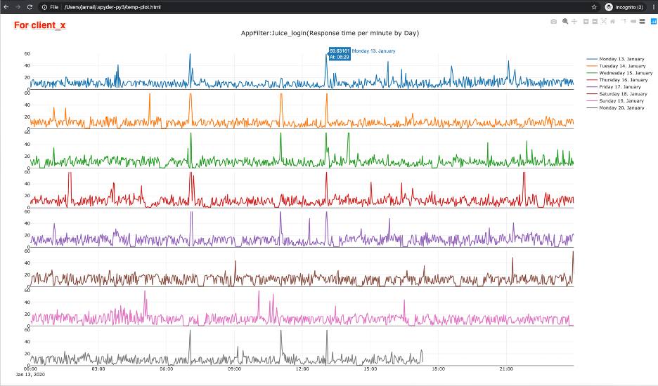
The data obtained from azure table storage will be received in a json format. Using python, we will convert it to a Pandas data frame and then use the open-source visualization library: Plotly to visualize it by creating an interactive web-based graph. Graph type: Stacked Subplots with Shared X-Axes where x-axis is each minute in a given day and y axis is http page load time (in seconds).
Importing all necessary packages
import datetime
import logging
import os
import sys
import numpy as np
import matplotlib.pyplot as plt
import pandas as pd
import plotly.graph_objects as go
from azure import storage
from azure.storage.table import TableService
from plotly.offline import plot
from plotly.subplots import make_subplots
Token required to communicate with azure table storage
SAS_TOKEN = ("Token_to_communicate_with_azure_table_storage")
Other parameters to get specific data from azure:
- Client instance name
- Number of days
- Start and end date
client_instance = 'www.client.com'
day_value = int(5)

start_dt, end_dt = get_start_and_end_datetime(day_value)
start_time = start_dt
end_time = end_dt

time_and_instance_filter = (
       f"PartitionKey eq '{client_instance}' "
       f"and RowKey gt '{epoch_from_datetime(start_time)}' "
       f"and RowKey lt '{epoch_from_datetime(end_time)}' "
   )

table_service = TableService(
       account_name='ACCOUNT_NAME',
       sas_token= SAS_TOKEN,
   )

rows = get_data(
       'WebBench', time_and_instance_filter, table_service
   )

data_frame = pd.DataFrame(rows)
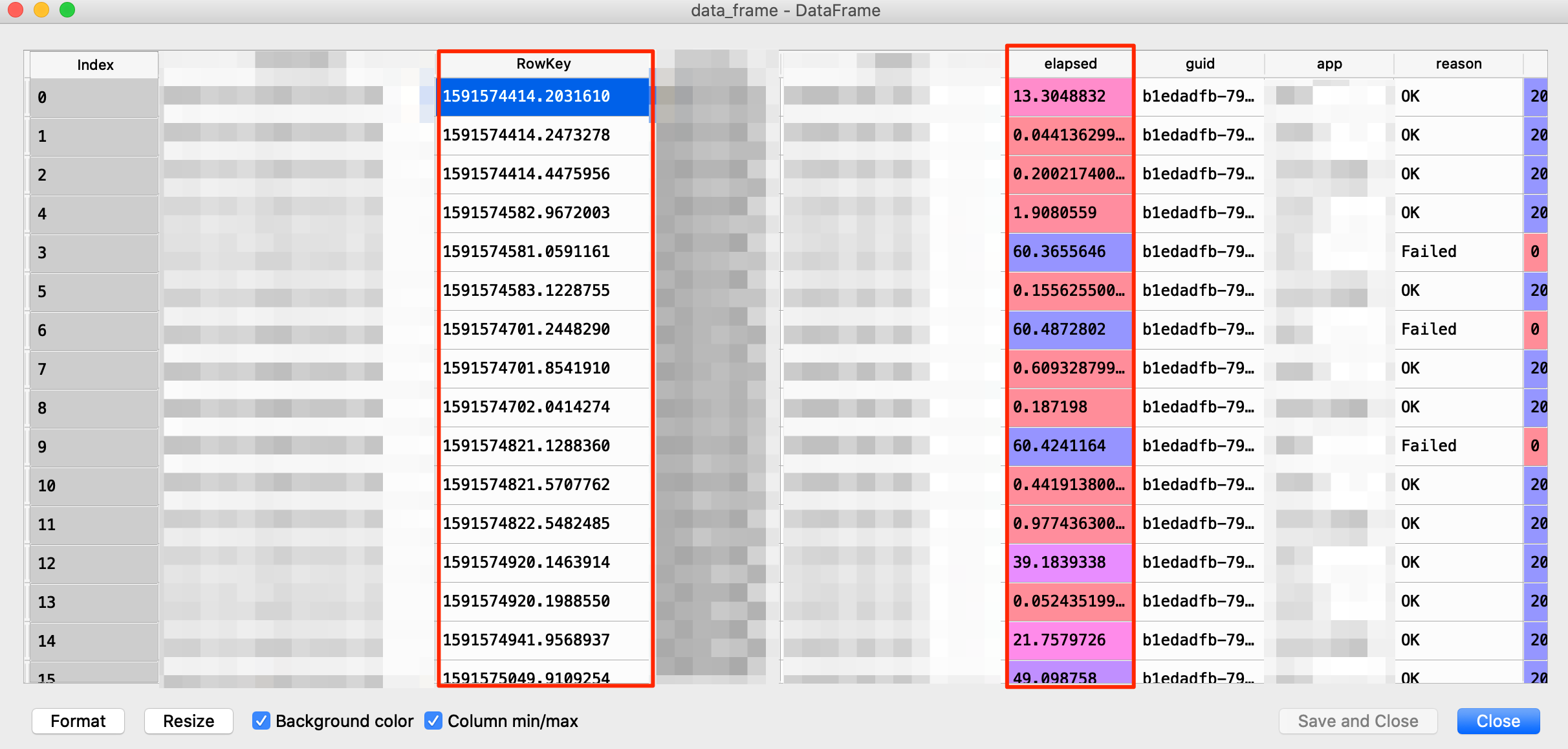
Querying azure table store will provide us with the following data which will be stored in a data frame. The example of this dataframe can be seen in the below image.
Original Data Frame
We only need these two columns:
- RowKey: epoch time stamp
- Elapsed: Page load time in seconds
df_new =  pd.concat([data_frame["RowKey"],data_frame["elapsed"]],
                       names = ['Time', 'Delay'], axis = 1)

df_new["time_from_rowkey"] = np.array(
       [
           datetime.datetime.utcfromtimestamp(float(d))
           for d in df_new["RowKey"]
       ]
   )

df_new = df_new.set_index("time_from_rowkey")
df_new = df_new.drop(columns = ["RowKey"])
Defining success/failure criteria:
Failure:. If the elapsed time value is equal to or greater than 60 seconds. It will be considered a slowdown and, as expected, the graph will display a spike.
Success:: If the reported elapsed time is less than 60 seconds.
Challenge
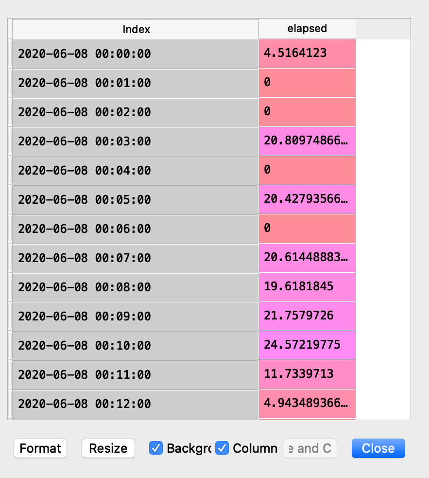
X axis graph data requirement : We need to have a graph with each minute of the day as x axis and webpage load time as y axis. But the provided data has more or less data points for a given day. For example, on a busy day it could have 10,000 rows or 1,000 on a slow day based on how much the client is using the system. We need each day to have the same number of data points, that is, 1440 (1 day = 1440 minutes). How do we achieve that? The answer is by using the resample python function. By using this function, we can group the data by each minute and then average the elapsed column time value for a given minute. So, even if we have 10,000 rows for a day, we always end up with 1440 rows after applying resample to the given Dataframe. [Code: example_df.resample(‘60s’).mean()].
Resampling the time series data based on minute
df_new = df_new.resample("60s").mean()
df_new = df_new.fillna(0.00)
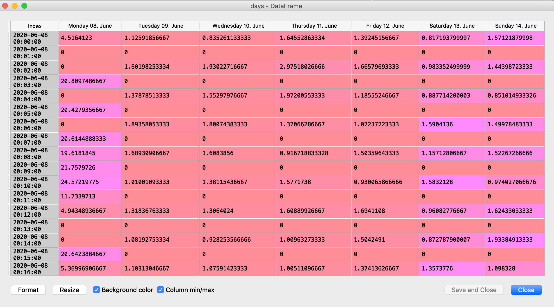
Generating the Daily graph:
days = pd.DataFrame()

for name, group in groups:
    days[name.strftime("%A %d. %B")] = group.elapsed

for name, group in groups:
        days[name.strftime("%A %d. %B")] = group.values
Days DataFrame
columns = days.columns.values
temp = list(range(0, len(days.columns.values)))

days = days.replace(0.00, np.nan)

for _ in columns:

        fig = make_subplots(
            rows=len(days.columns), cols=1, shared_xaxes=True, vertical_spacing=0.012
        )

        if days.values.max() > int(60):
            fig.update_yaxes(range=[0, int(days.values.max()) + 1])
        else:
            fig.update_yaxes(range=[0, 60])
        for i in temp:

            index_mask = np.isfinite(days[days.columns[i]].astype(np.double))

            fig.update_layout(
                title_text= "Response time per minute by Day"
            )
            fig.add_trace(
                go.Scatter(
                    x=days.index[index_mask],
                    y=days[days.columns[i]][index_mask],
                    hovertext=[
                        "At: " + i.strftime("%H:%M") for i in days.index[index_mask]
                    ],
                    hoverinfo="text+y+name",
                    name=str(days.columns[i]),
                    hoverlabel=dict(namelength=-1),
                    showlegend=True,
                ),
                row=i + 1,
                col=1,
            )

            fig.update_layout(template="none")

            plot(fig)
Result:
Full Interactive HTML Version Here
Generating the Weekly Graph:
groups = df_new.groupby(pd.Grouper(freq="W"))

weeks = pd.DataFrame()


for name, group in groups:

        sub_group = pd.DataFrame(group.groupby(group.index.hour).mean())

        fig = go.Figure()

        for _ in sub_group:
            weeks[
                "Week:" + str(name.week) + " (" + str(name.year) + ")"
            ] = sub_group.elapsed

            fig.update_yaxes(range=[0, 20])

            for i in list(range(0, len(weeks.columns.values))):
                fig.update_layout(
                    title_text=
                     "Avg Page Load Time per hour by Week"
                )
                fig.add_trace(
                    go.Scatter(
                        x=weeks.index,
                        y=weeks[weeks.columns[i]],
                        hovertext=[f"At hour: {i}" for i in weeks.index],
                        hoverinfo="text+y+name",
                        name=str(weeks.columns[i]),
                        hoverlabel=dict(namelength=-1),
                        showlegend=True,
                        mode='lines+markers'
                    )
                )
                fig.update_layout(template="none")

        plot(fig)
Result: