Lets say we want to convince upper management of an example company to hire new Helpdesk employee(s).
The below graph shows total number of help-desk tickets received and processed by the company from Jan to Dec.
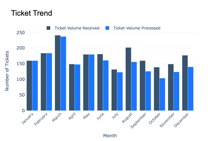 Bad Graph
Although this graph has the necessary data, it lacks very important points to clarify our objective. The reader does not understand what the graph is trying to communicate. A good graph is one that lets its readers know in a single glance what exactly is the being communicated.
After organizing and modifying parts of the above graph, we should get something similar to the below example. The below graph uses the same data as the one above.
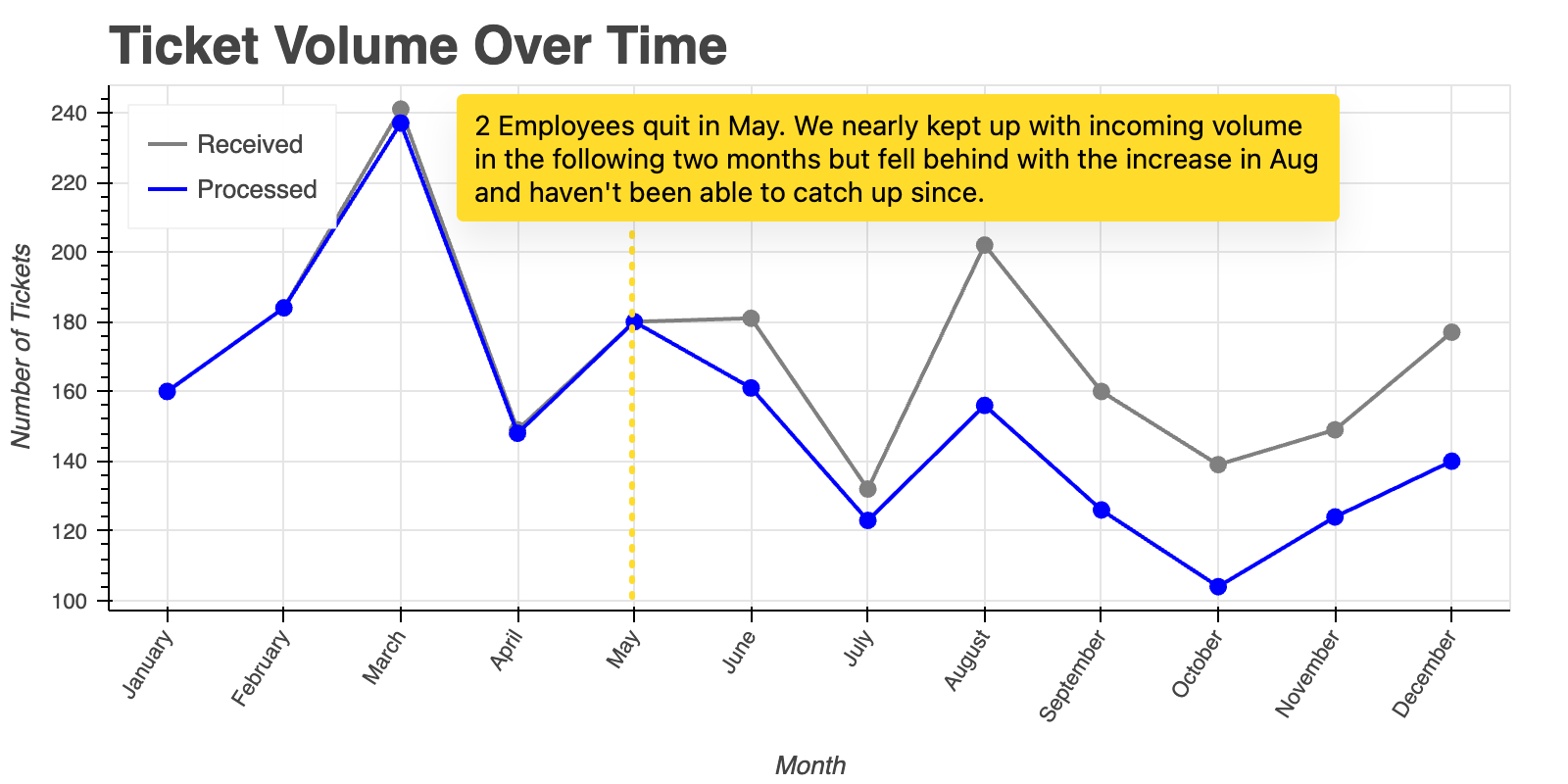 Good Graph
Here, it is much more clearer that we want the reader(s) to approve hiring of 2 new help-desk analysts [Title] as the gap between Received & Processed tickets is gradually increasing since May [Added Annotation].
In conclusion, a good graph should:
- TELL A VISUAL STORY
- BE EASY TO UNDERSTAND
- BE TAILORED TO YOUR TARGET AUDIENCE
- BE USER-FRIENDLY
- BE HONEST